Omega
This iPad app is the Omega in-store digital catalogue. The swiss luxury watch manufacturer uses it as a tool to showcase its collections in stores all around the world.
Video screencast of Omega digital catalogue on iPad
To improve the catalogue, Omega wanted its customers to be able to browse the Straps & Bracelets collection at the same time as the watches. The goal is to be able to see which straps are compatible with the selected watches and vice versa.
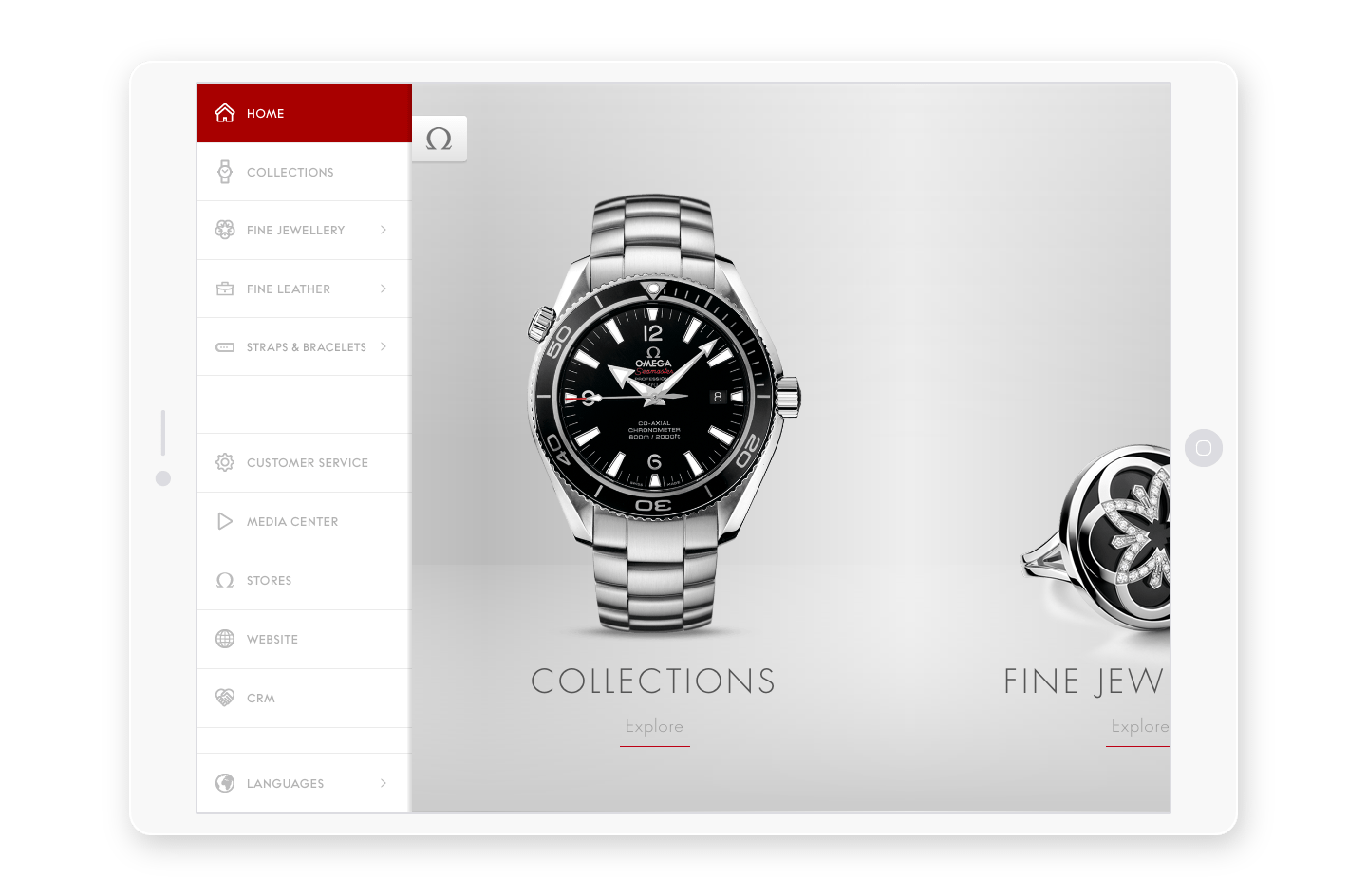 The sidebar menu allow to browse the main categories

The app has two goals; allow the customers to discover the products and choose the one that fit their needs and offer the shop employees a powerful sales tool to browse thousands of references painlessly.
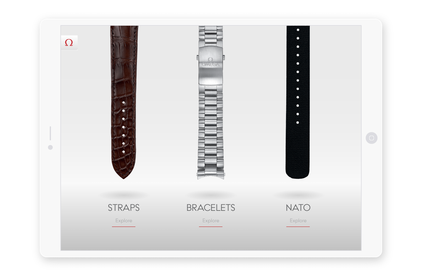 A clear visual distinction in-between the three bands categories

When designing for luxury brands it’s very important to honor the quality of the visual material. The watches and the bands are full of details and precision and this has to be reflected in the design of the interface.
Dealing with bulky images can slow down the app and drain the battery of the device while low resolution images can’t guarantee the level of details needed to showcase those high precision products. Finding the perfect balance in-between image quality and file size is essential to provide the best experience for people.
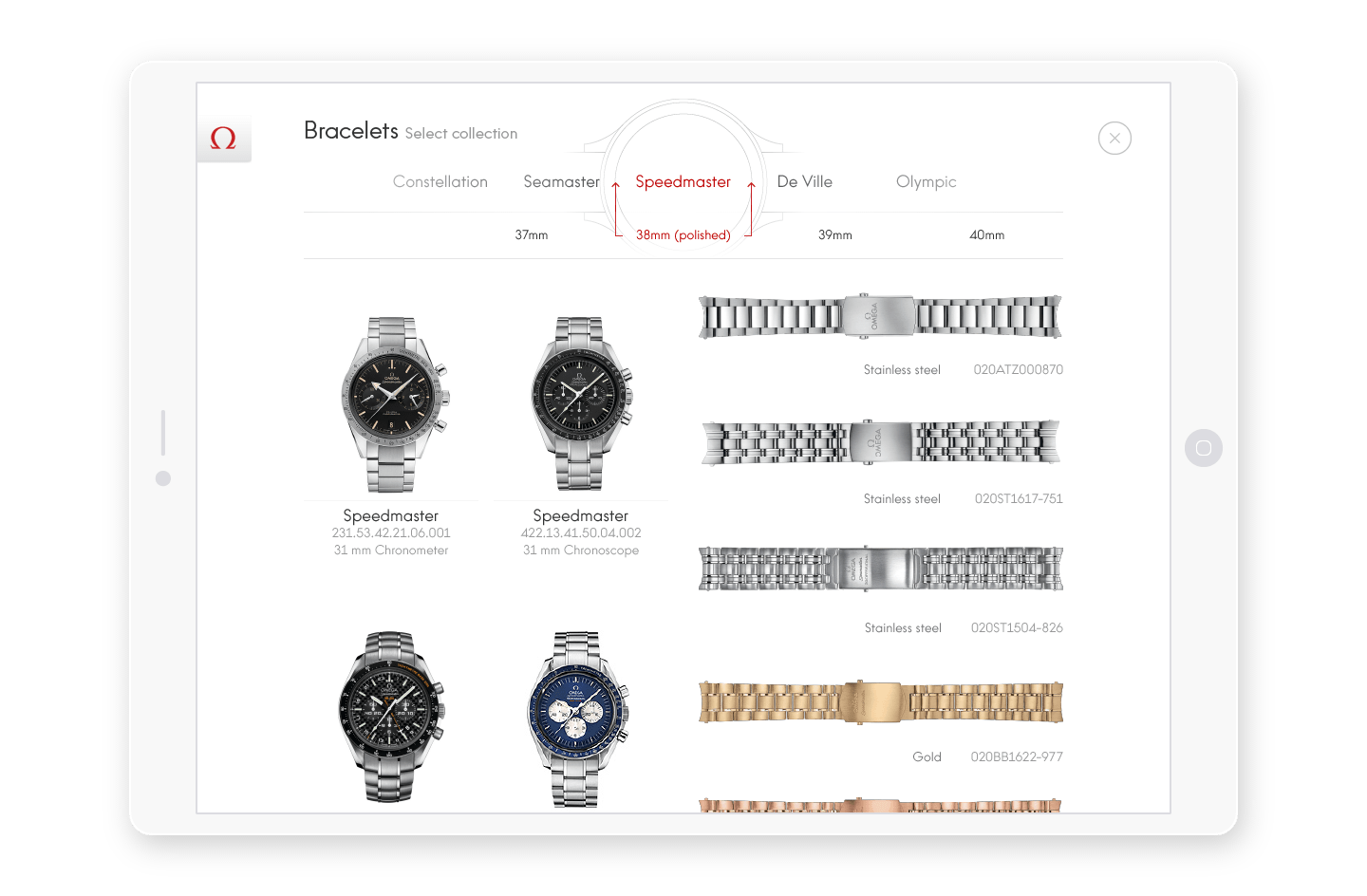 This side-by-side layout allow the people to compare watches and bands

Omega’s collection is composed of thousands of watches and cross-references. A particular watch can match dozens of bands which can match other watches. This level of complexity demand a high understanding of the structure of the database to be able to provide a simple interface that helps the customer discover the products and the sales assistant to quickly find a precise reference without having to dig into enormous printed catalogues.
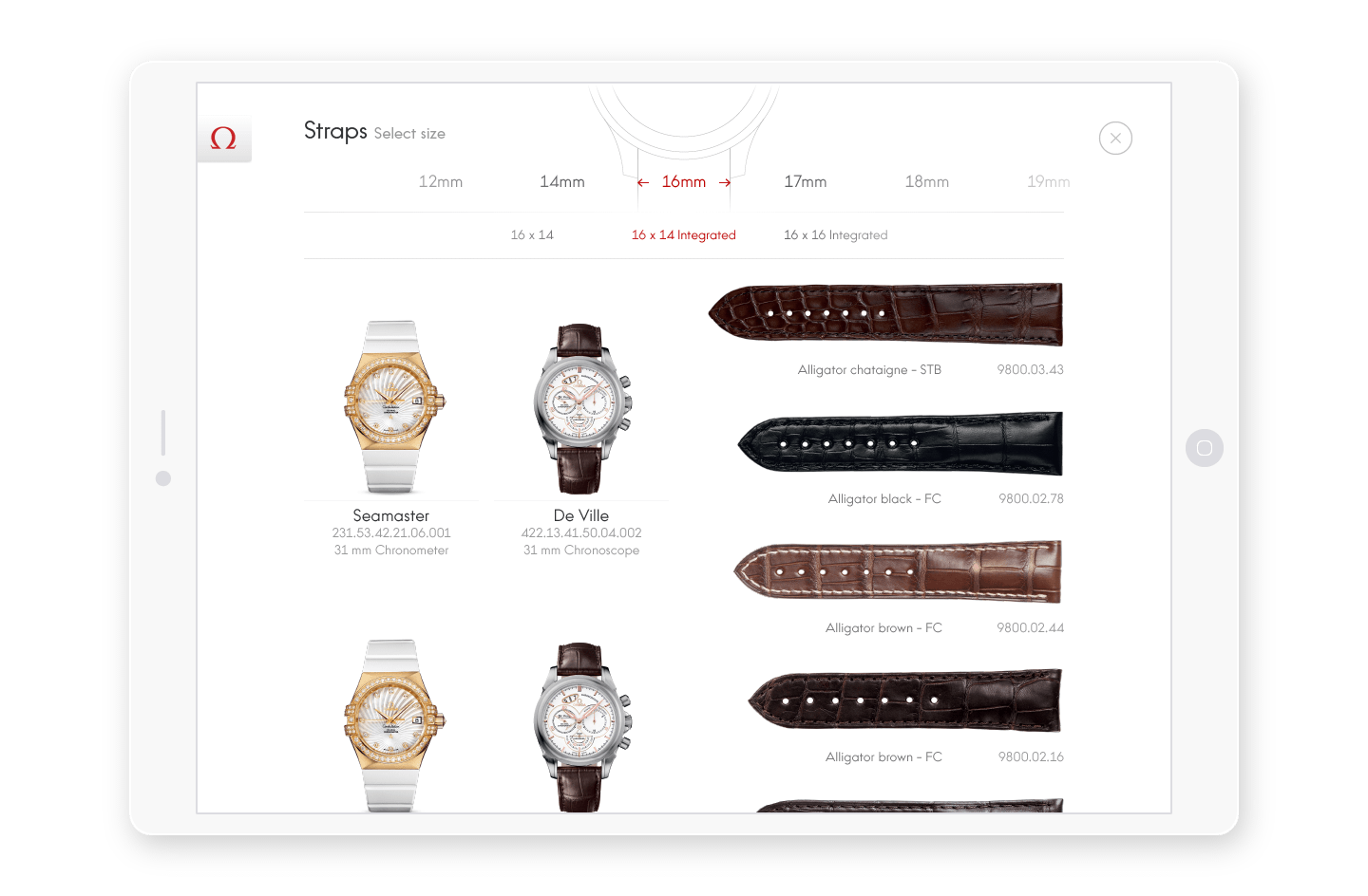 Each band category has its own filtering system. Leather bands are defined by their width while metal bracelets are sorted by the diameter of the dial.

The filtering system had to be flexible enough to support the collection updates in the future. The horizontal wheel selector can integrate an infinite number of items so it’s easy to add a new dial diameter or a new collection name if needed.
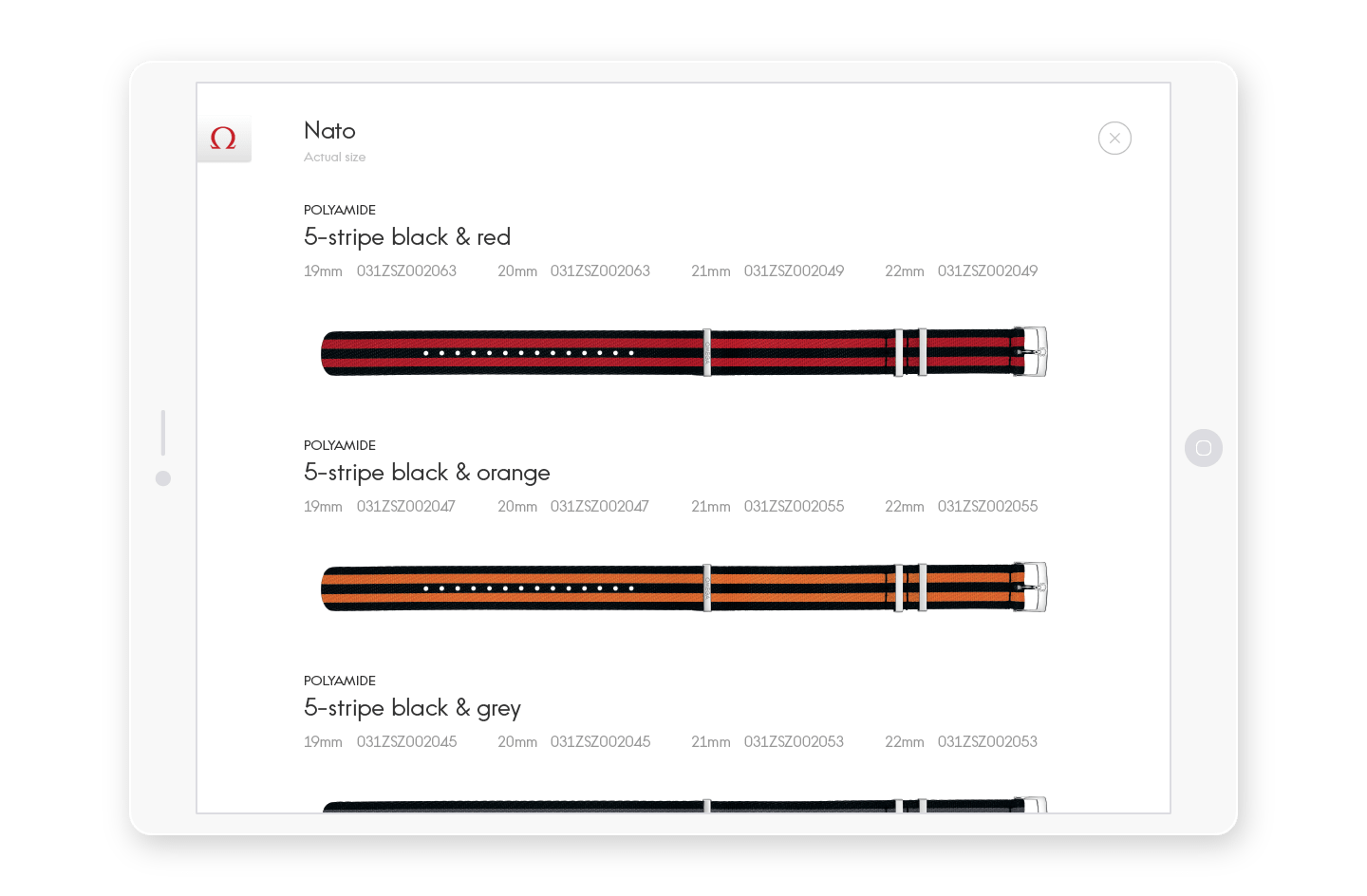 A custom layout for this special kind of bands called NATO

The application also allows the sales assistant to register customer’s information when they buy a product. To validate the information, the customer have to sign the form with the signature feature.
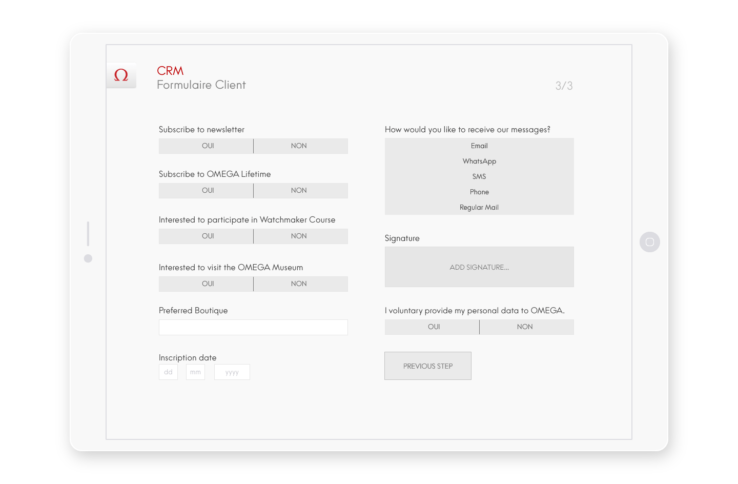 In the form, the sales assistant can register the customer’s signature

The signature step is fullscreen so the sales assistant doesn’t need to explain where to sign when passing the device to the customer because there is only one task to focus on. It is also easier to sign with the finger on a large surface.
![The [Validate] button is greyed out until the sign area is filled A tablet showing the signature screen](/images/bread-and-butter/omega/Portfolio_BB_Omega_07.png) The [Validate] button is greyed out until the sign area is filled
The [Validate] button is greyed out until the sign area is filled
![The [Validate] button is greyed out until the sign area is filled A tablet showing the signature screen](/images/bread-and-butter/omega/Portfolio_BB_Omega_07.png)
![Once the sign area is filled, the [Validate] button is activated A tablet showing the signature screen with signature](/images/bread-and-butter/omega/Portfolio_BB_Omega_08.png) Once the sign area is filled, the [Validate] button is activated
Once the sign area is filled, the [Validate] button is activated
![Once the sign area is filled, the [Validate] button is activated A tablet showing the signature screen with signature](/images/bread-and-butter/omega/Portfolio_BB_Omega_08.png)
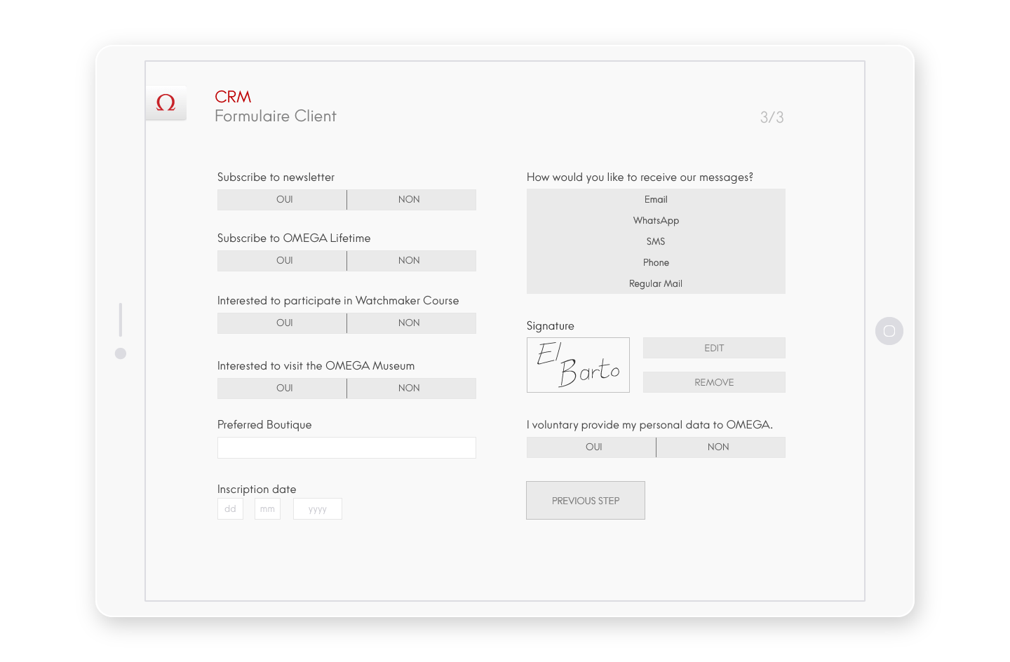 After validation, the signature can be edited or deleted from the form interface

For this project, I was in charge of User Research, Visual Design, Interaction Design and Information Architecture. The greatest challenge was to understand and master the content’s complexity to provide the best experience for both the customer and the sales assistant with a simple interface.
© 2015 Bread & Butter — All Rights Reserved