Wonderalp
Wonderalp is a cabinet of curiosities based on Alps travel diaries written by scientists from the 16th to the 18th century in Switzerland. The app showcases engraving illustrations and tales that guide the user between myth and science and help to understand the scientists’ wonder at nature at that time.
Video screencast of Wonderalp on iPad
The application is available on the App Store and the Play Store. It has been designed and developed as a web app because it’s meant to be a website in the future. The grid layout is fluid and adjustable to a responsive environment.
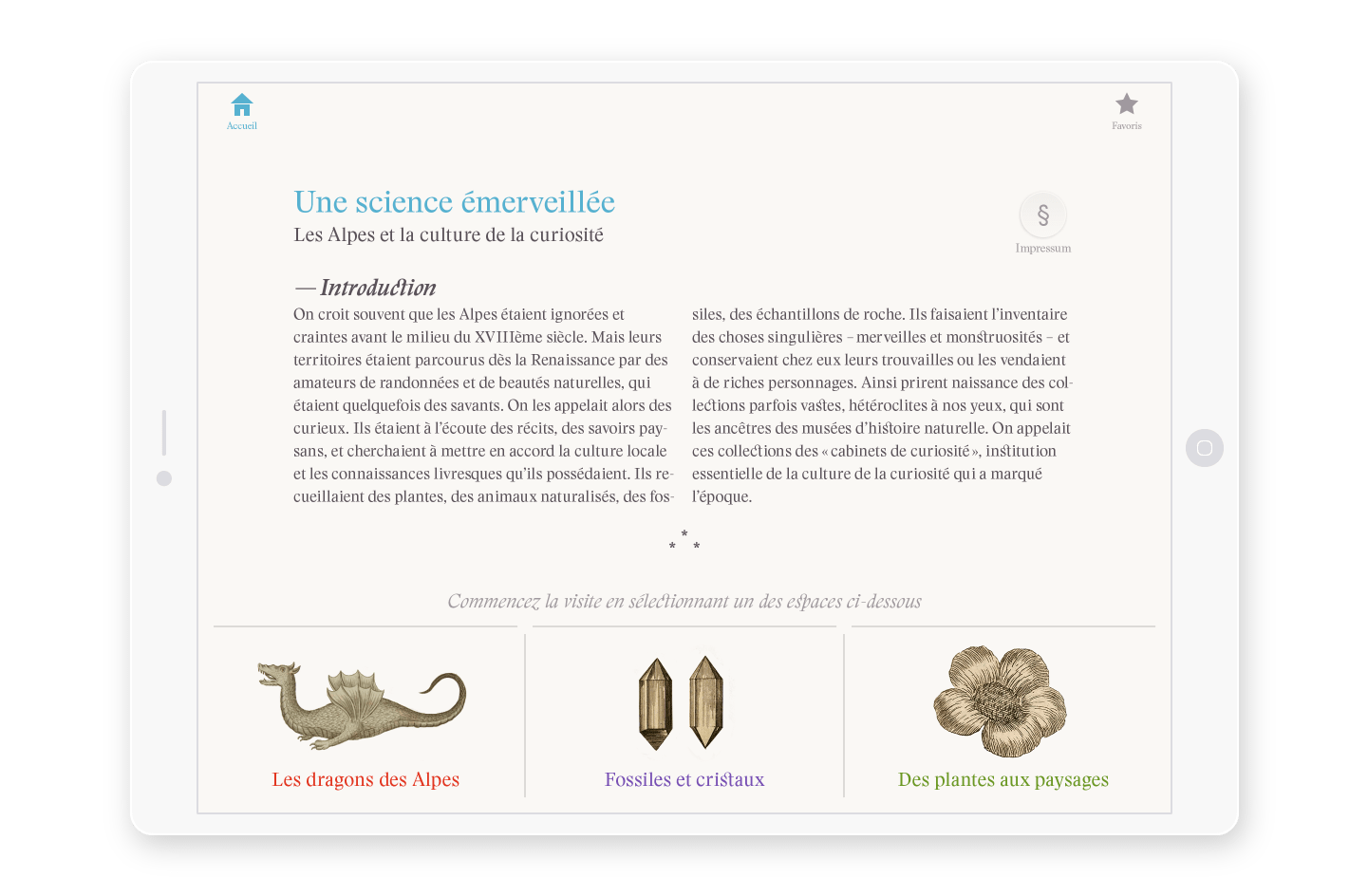 On the home page, the user can access 3 environments (dragons, crystals and plants)

The navigation has been thought to give the user a feeling of travel and discovery. The sound design and the stories told by theatre actors are meant to intensify the immersion into this singular world.
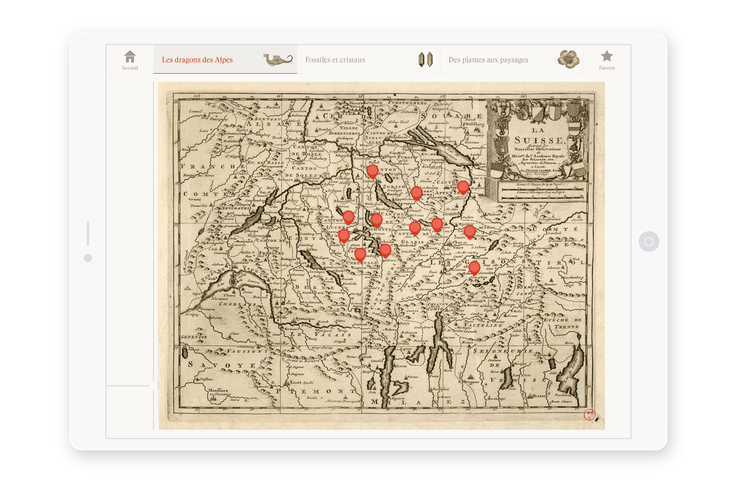 Navigate to the different dragons apparitions with the map

Images are a fundamental component of the application and so they have been handled with a special care. The challenge was to find the best compression libraries such as pngquant or jpegotpim to limit files size while keeping a good image quality and ensure a respectful rendering of the archived documents.
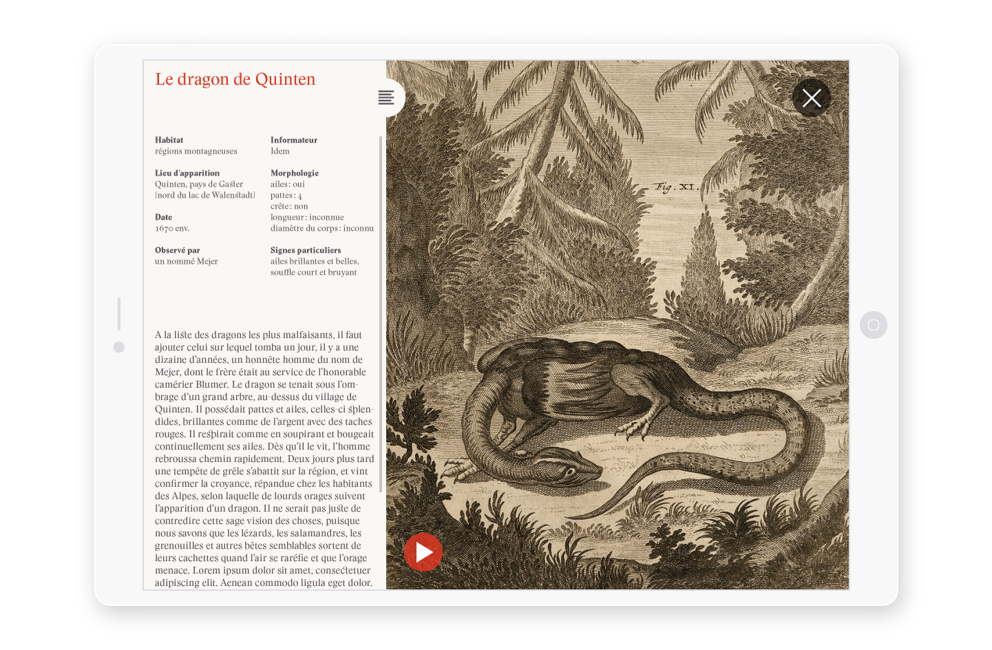 Explore the Alps dragons univers through rich engravings and fascinating stories

The stories gathered by those atypical scientists are transmitted through writings so good typography treatment is important. The Stanley typeface has a contemporary design inspired by ancient documentation as much as the application itself and so it’s a perfect match in this context.
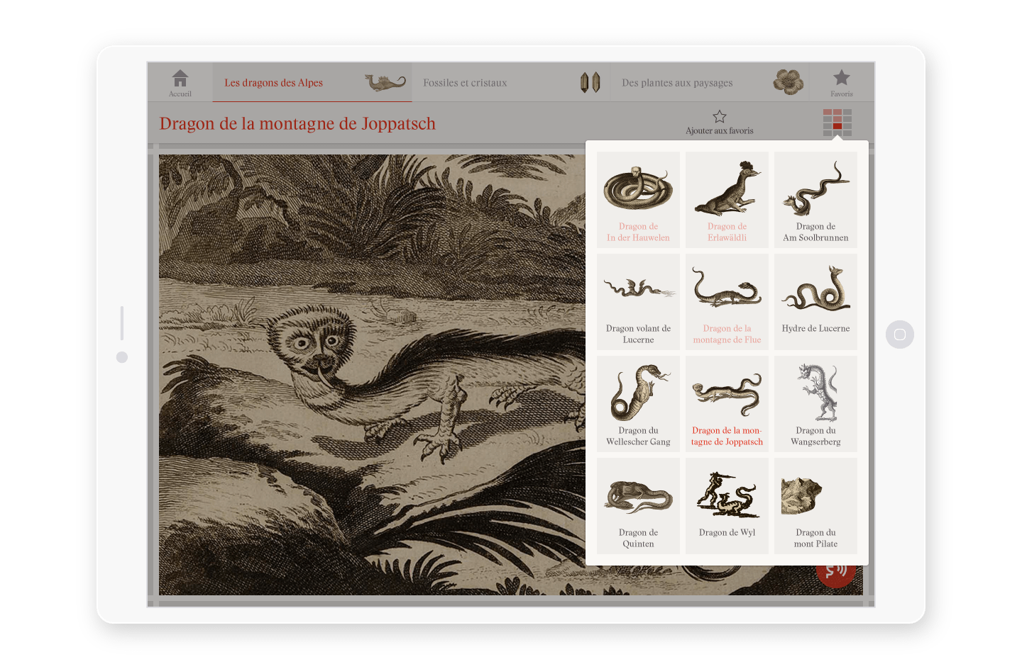 Discover more things with advanced menus

For this project I was in charge of both Visual and Interaction Design. I collaborated closely with the client on Information Architecture through regular meetings and workshops. We had to respect both the scientific value of the content and the User Centered Design approach.
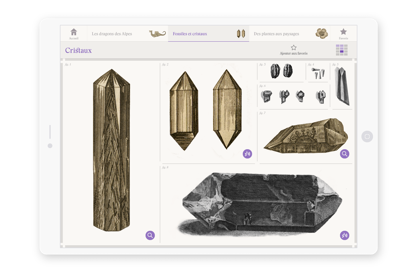 Dig into a large collection of objects

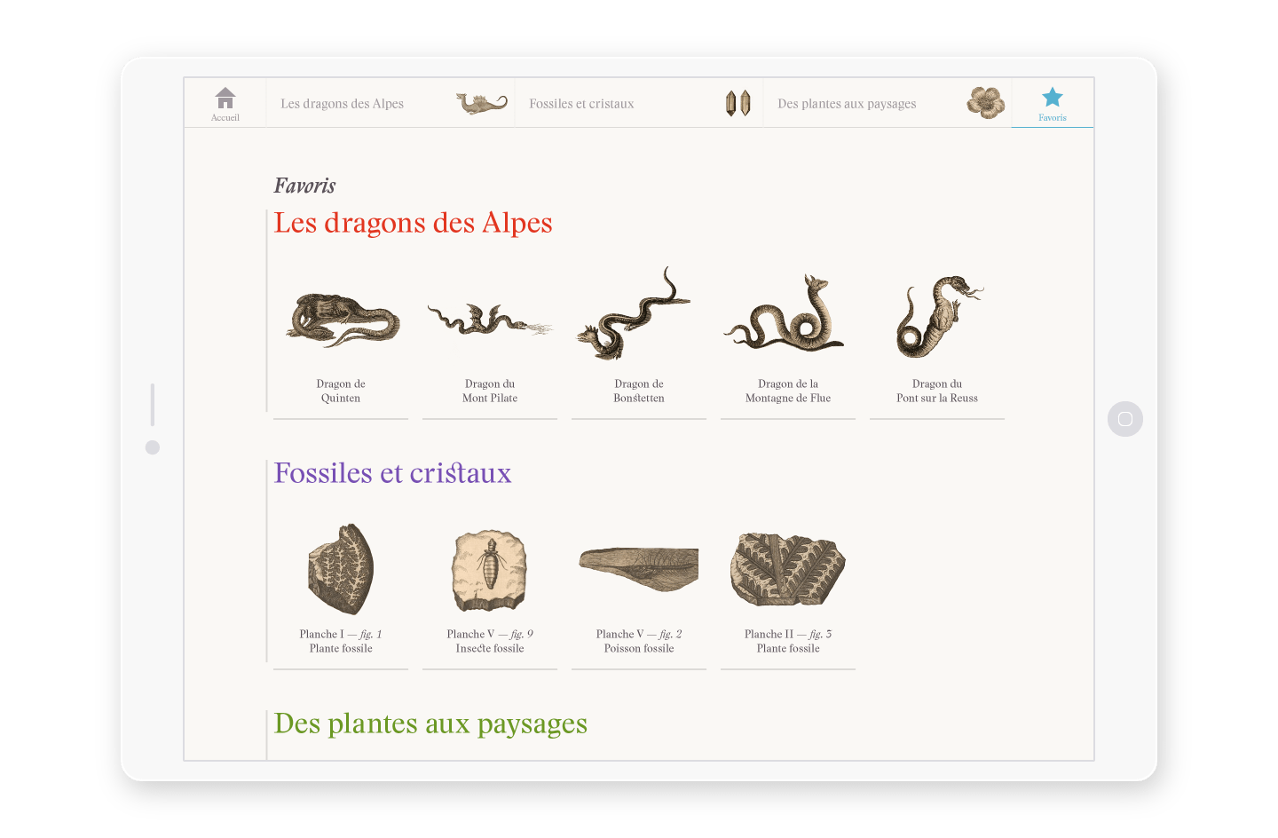 Favorite elements for a direct access

© 2015 Bread & Butter — All Rights Reserved